
Crossy Road: the fine art of not going yet
You can explain Crossy Road before the chicken reaches the first car. Playing it well takes longer. Let’s look at how a hop becomes a decision, how a safe patch of grass shapes the whole run, and why a new character can matter without being stronger.
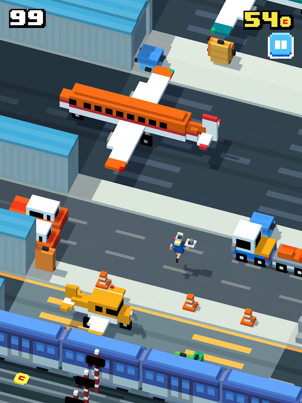
A later airport theme in the classic app. Changing the scenery adds character, while lane boundaries still have to make the next crossing readable.
In this guide
The core endless hopper, with development and business decisions dated to the team’s 2015 accounts. Screenshots show later themes in the classic app. Special Delivery is an original Dashpop teaching game, not a recreation of Crossy Road’s generation, collision rules, or tuning.
- Made by
- Hipster Whale: Matt Hall, Andy Sum, and Ben Weatherall
- Looking at
- Classic mobile game; 2014 launch and 2015 development accounts
- Design question
- Timing, anticipation, readable danger, and expressive progression
A small verb with a lot behind it
Hipster Whale released Crossy Road in November 2014. Its familiar situation is crossing roads, railway tracks, and rivers one hop at a time. Matt Hall and Andy Sum built it with artist Ben Weatherall. Those facts establish the starting point. The useful design question is what the player has to understand between two hops.
A tap seems to ask, “Can I stand there?” A good decision also asks, “What will reach that square after I arrive, and where will I go next?” Position, timing, and an exit plan fit inside a very small action. You can know the controls perfectly and still be learning the game.
Our reading is that the game’s strength lies in how much of that reasoning appears directly in the scene. An approaching vehicle shows a changing deadline. A strip of grass offers a place to think. The distance ahead offers a goal. The player does not need a paragraph of rules to begin forming a plan.
For your own game, write down the smallest action, then list the different questions it can answer. If every tap means exactly the same decision in exactly the same circumstances, adding more buttons probably will not help. Change the situation around the action first.
Your turn ends. The road’s turn does not.
Imagine a courier standing at the curb. A van has just passed, leaving an empty square. The courier steps into it and pauses to decide what to do next. Another van arrives. The move was legal, and the plan still failed.
This is a useful combination: the character moves in discrete choices while the environment moves continuously. A board game often lets you inspect a state that waits for your answer. Here, inspection spends time. There is no separate “thinking phase” with the world politely holding its breath.
That changes what safe means. A safe destination is a claim about an interval, not a photograph. You need enough room to enter, recognize the next situation, and leave. A gap that permits an instantaneous hop may still be a poor place for a human who needs a moment to respond.
A fictional example makes the timing visible. Suppose a vehicle is three squares away and moves at two squares per second. Its center reaches your column in 1.5 seconds. If your arrival, recognition, and next hop take most of that interval, the apparent gap has very little slack. Vehicle width makes the usable interval shorter still. These are teaching numbers, not Crossy Road’s values.
Before increasing speed in a prototype, inspect that slack. You may be shortening an interesting decision, or removing the time needed to perceive the decision at all. Both changes make people lose more often. Only one necessarily deepens the challenge.
Play it: get the parcel across
Special Delivery gives you three roads, safe grass between them, and a postbox at the top. Begin with paused traffic. Move into a road and advance time in quarter-second steps. Notice how quickly a place that looked empty becomes occupied. Then restart and run traffic continuously.
The forecast adds dashed outlines showing where cars will be in 0.6 seconds. Compare a run with that help to a run without it. The overlay supplies a prediction; it does not choose your route or guarantee your timing. If it helps, what information were you previously estimating?
Finally, try the progress clock. Only a new furthest row resets it. Walking backward and forward does not buy extra time. This eight-second rule belongs to our experiment; it is not a measurement of Crossy Road’s eagle.
Special delivery
Three roads. One parcel. Use the arrow buttons, or focus the crossing and use your arrow keys. Grass is safe. Cars keep moving when you stand in the road.
Row 0 of 6 · 0.0 seconds. Dashed outlines predict car positions, not safe routes.
Traffic is paused. Move the courier, then step time to inspect what happens next.
Compare the same crossing with and without the forecast. Paused play is a planning aid; running traffic adds the timing problem. These are original Dashpop rules, art, and timings.
The grass is doing design work
A safe strip looks like an absence of content. In a moving-hazard game, it is a resource: a place to observe without simultaneously dodging. That lets the designer arrange bursts of commitment around moments of preparation.
Consider two original layouts. In the first, three roads touch each other. In the second, each road has grass after it. The vehicles can have identical speeds and spacing, yet the experience changes. The first asks you to plan a sequence before entering. The second lets you solve one crossing, recover, and inspect the next.
Neither arrangement is automatically better. Continuous exposure can produce an exciting commitment. Frequent refuges can make a first lesson readable. The mistake is treating the grass as wasted space and deleting it before understanding what it makes possible.
There is also a difference between safety and unlimited delay. Contemporary reporting describes Crossy Road’s eagle punishing excessive waiting or retreat. That creates pressure beyond the immediate hazard. In your own version, decide whether such pressure serves the intended mood. A gentle crossing puzzle may need no deadline at all.
Try removing the clock before changing the roads. If the player suddenly makes sensible plans, they may understand the spatial problem but need longer to read it. If they still step into the same trouble, more time is not the missing ingredient.
Cute is allowed. Ambiguous collisions are expensive.
In the 2015 making-of interview, Sum describes wanting clearly judged collision boundaries. The same account describes initial concern about Hall’s angled camera, followed by a prototype that convinced the team. Presentation and precision were questions they worked through together.
A useful lesson is to distinguish the character’s visible body, its ground position, and the shape that actually collides. In an angled view, a tall object can appear to overlap something behind it. The player needs dependable cues about where contact really happens.
In a prototype, ask someone to point at the last safe position before they move. Then show the collision boundary. If those disagree, inspect shadows, perspective, sprite overhang, and contact timing. Do not assume that a smaller hitbox solves every mismatch. A forgiving boundary can still be confusing when nobody can predict it.
The airport-themed screenshot above has buses, trucks, an aircraft, and strong horizontal bands. Notice what you use to identify a travel lane despite the busy theme. Then cover the decorative objects mentally and ask what minimum information you would need to cross. This is a reading exercise, not evidence of how every player perceives the scene.
An effective art direction gives a game identity while preserving the relationships needed for action. A pretty hazard that is hard to locate has borrowed attention from the mechanic. Sometimes that is a deliberate trade. Often it is just an expensive accident.
Spend the thumb’s effort where the choice is
The team’s GDC slides describe settling on tapping for most movement and swiping when needed. Their account treats the comfort of repeated input as part of the design problem.
That is worth testing separately from difficulty. A repeated gesture can be physically tiring while requiring little thought. An occasional directional correction can be cognitively demanding while taking almost no physical effort. If you measure only failure rate, those costs disappear into one number.
For a touch prototype, watch the player’s hand as well as the character. Does the finger obscure the landing area? Do they reset their grip between attempts? Does a swipe become a tap near the edge of the screen? Those are observable interaction problems, not evidence that the player needs more skill.
Make a small input ledger: the common action, the exceptional action, and the action used to recover. Give the common action a comfortable gesture. Make the exceptional action distinct enough to trust. Then test recovery in the exact situation where the player is likely to rush.
Fresh scenery, familiar questions
Crossy Road’s press material includes roads, trains, rivers, and a large cast of characters. A useful way to study that variety is to ask which changes require a new kind of prediction and which mainly change the feeling of a familiar one.
For an original crossing game, compare a rolling cart with a moving platform. Both move sideways. One is something to avoid; the other might be something to board. Similar motion can support different rules, so the visual distinction has to arrive before the player commits.
Now compare a cart wearing flowers with the same cart without them. If the timing and collision remain unchanged, the new appearance can provide novelty without another rules lesson. That is valuable, provided the decoration does not disguise a boundary or imply a new ability.
The dinosaur-themed image below makes a useful discussion prompt: which objects look like creatures, which read as ground, and which suggest a route? We are looking at a later theme, not reconstructing the launch build from a modern screenshot.
For your first generator, author a few short sequences by hand. Check that each has a place to observe, a readable commitment, and an exit. Only then vary speed, width, or order. A generator that produces endless arrangements is easy to admire in code and surprisingly easy to distrust in play.
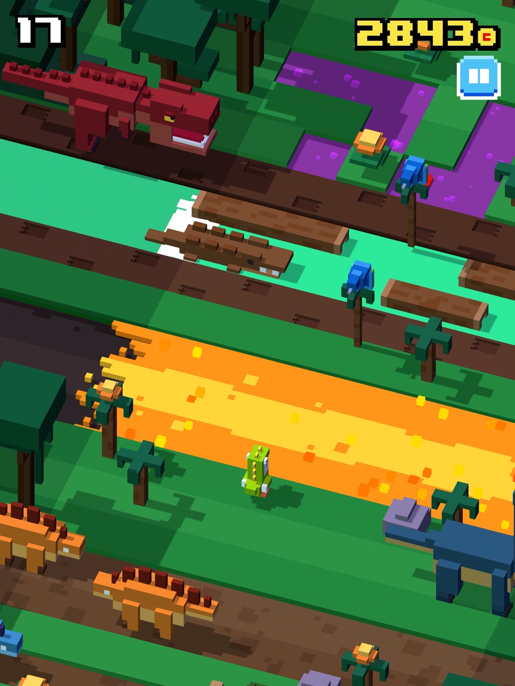
A later dinosaur theme in the classic app. Compare how solid ground, moving obstacles, and possible routes are distinguished. This image does not document the 2014 launch build.
A new character can change the reason to return
The 2015 GDC presentation describes characters sharing gameplay behavior, opt-in rewarded video, and an original economy without an energy gate or a paid save after failure. Treat that as a dated design account, not a promise about every current edition.
This suggests two kinds of progress worth separating in your own project. Performance progress says, “I can cross farther.” Expressive progress says, “I can be the character I like.” The second gives someone something to care about even during a session where their best score stays stubbornly still.
If an unlock also grants more speed or extra lives, it changes the meaning of performance comparisons. A higher score might reflect better play, a stronger loadout, or both. That can support an excellent progression game, but it is a different promise from a contest with a stable skill baseline.
Cosmetic content is not free to make just because it does not alter stats. Each character still needs a readable silhouette, animation, presentation, and testing against the rest of the scene. Begin with two expressive alternatives and ask whether anyone develops a preference. Fifty indifferent choices are not an improvement over two loved ones.
You can test the distinction without building a shop. Let a player choose a courier outfit before a run. Ask what made them choose it, then observe whether they expect different abilities. If the art promises powers the rules do not deliver, the label “cosmetic” may arrive too late.
A loss is also a handoff
The GDC account notes substantial work on surprising end-of-run presentation. That is a reminder that a short game spends a lot of its life at the boundary between attempts.
There are at least three jobs at that boundary: explain what happened, let the player decide whether to continue, and make the next action easy to find. Humor can help the emotional transition, but it cannot replace the first two jobs.
Try freezing a collision for a moment before presenting the result. Show the distance and leave a clear restart action. Ask the player what caused the loss before you explain it. If they cannot tell, a funny animation may make the failure pleasant without making it learnable.
For a commercial game, this is also a tempting place to put offers. Every extra layer competes with the memory of the mistake. If you add an interruption, measure whether the next attempt still begins with a plan. A restart count by itself cannot tell you whether people understood anything or simply kept tapping.
A small game is not a small amount of judgment
Crossy Road is a useful small-team case because its central action is compact. It is less useful as a promise that a compact action guarantees a breakout. The visible game does not isolate the effects of timing, distribution, community, presentation, or luck.
The part a new maker can borrow is an approach to scope. Spend your first effort on one clear action, one credible hazard, and one reason to try again. Then use play to decide what deserves more work. A character roster or procedural world should extend a working relationship rather than conceal an empty one.
A scope budget might give you one afternoon for a crossing with three lanes, another for controls and readable contact, and a third for watching people play. Those are planning examples, not estimates for reproducing a commercial release. Stop expanding the map when the next unknown concerns the first ten seconds.
The most useful question is not “How many features did the hit ship with?” It is “Which uncertainty can my next small build resolve?” That keeps the study relevant even when your audience, team, and distribution are completely different.
Build a crossing with a point of view
A strong finding sounds like this: “People could predict the first vehicle, but the next lane was hidden behind the result of their hop. Moving the camera let them plan two actions ahead.” That tells you what to build next. “It needs more polish” does not.
The chicken’s question has always been easy to ask. The designer’s question is better: what makes crossing this road worth thinking about?
- Choose an original setting with a reason to cross: a parcel depot, a crowded kitchen, or a maintenance robot moving between conveyor belts.
- Build a short authored route with three hazards and visible safe ground. Keep movement and collision rules consistent.
- Prepare two layouts with the same hazards: one with frequent refuges and one with a longer exposed sequence.
- Give each player both versions in alternating order. Record where they pause, what they look at, and the mistake they believe ended the run.
- Change one thing that addresses an observed problem. Check that the fix helps the intended judgment, not just the score.
Sources & further reading
Official material and creator accounts behind this analysis. The interpretations, examples, and interactive models are Dashpop’s own.
Put your idea to work with the Dashpop Game Engine. Describe a game, play it quickly, and shape it yourself. Start with one change you can test.